
Ever opened a website on your phone and had to zoom in, scroll sideways, and struggle to click tiny buttons? Frustrating, right? Now imagine that is your website. Your visitors won’t wait; they will just leave. This is why mobile-friendly websites are a must. If your site does not work smoothly on phones, you are losing traffic, leads, and sales.
At Connect Solutions, we build websites that look great on any screen. Because in today’s world, if your site is not mobile-friendly, it might as well not exist.
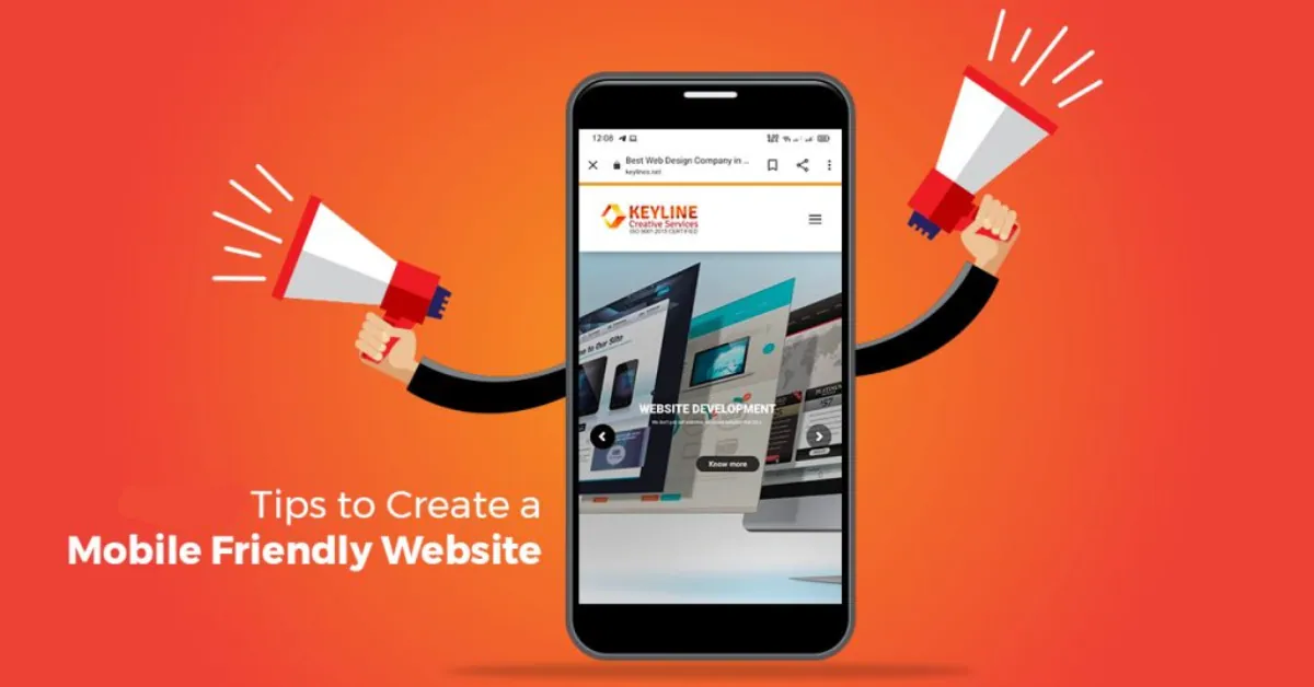
Mobile-Friendly Websites: Why They Matter
More than 60% of web traffic comes from mobile devices. That means if your site is not optimised for mobiles, Most of your visitors are having a bad experience. And guess what? Google hates bad user experience. If your website is not mobile-friendly, it gets pushed down in search results. The result?
- Fewer visitors
- Lower rankings
- Lost customers
A mobile-friendly website is not optional anymore; It is necessary for business success.
Responsive Web Design – The Key to a Mobile-Friendly Website
A responsive website automatically adjusts to fit any screen. Big or small, it looks perfect. If your website breaks on mobile, that is a big problem.
How to Make Your Website Responsive?
- Use a flexible layout: Your design should adjust to different screen sizes.
- Optimise images: Heavy images slow down mobile sites. Keep them light.
- Make buttons and links bigger: Nobody likes clicking tiny buttons by mistake.
- Use readable fonts: If people have to zoom in to read, they will leave.
At Connect Solutions, we make sure every website is fully responsive.
Because a great mobile experience keeps visitors engaged and coming back.
Web Development Tips – Making Your Website Mobile-Friendly
Creating a mobile-friendly website is not just about shrinking it down. It is about designing for mobile users first. Here are some top web development tips to make sure your site is fast, smooth, and user-friendly on any device.
1. Keep It Simple and Clean
A mobile screen is small. A cluttered website means a bad experience.
- Use a simple layout with clear navigation.
- Avoid too many pop-ups that annoy mobile users.
- Focus on the most important content first.
If your website is too complicated, Users will leave within seconds.
2. Speed Matters – Make Your Site Load Faster
Nobody waits for slow websites. If your site takes more than 3 seconds to load, People leave and never return.
How to speed up your website?
- Compress images: Large images = slow load times.
- Use caching: Helps load pages faster.
- Minimise code: Clean, optimised code = faster website.
- Choose fast hosting: Your hosting provider affects speed.
At Connect Solutions, we make sure every website loads in seconds, not minutes.
3. Mobile-Friendly Navigation – Easy to Use, Easy to Find
Ever visited a site where the menu is impossible to use on mobile?
That is a big mistake.
- Use a simple, drop-down menu.
- Keep important pages easily accessible.
- Make sure the search bar is visible.
The easier it is to navigate, the longer visitors stay.
4. Optimise Forms for Mobile Users
Filling out forms on mobile can be a nightmare. Tiny fields.
Hard-to-click buttons. Auto-correct is messing things up.
How to make forms mobile-friendly?
- Use big, easy-to-tap form fields.
- Keep forms short and only ask for necessary info.
- Enable auto-fill to save users time.
The easier your forms are, the more conversions you get.
5. Make It Thumb-Friendly
People use their thumbs to navigate on mobile.
If your website is not designed for thumb scrolling,
It is frustrating to use.
- Place buttons where thumbs can easily reach.
- Keep clickable elements large and well-spaced.
- Avoid making users zoom in to click something.
6. Use Mobile-Friendly Fonts and Colours
If users have to squint or zoom in to read text,
They won’t bother.
- Use clear, readable fonts not too small, not too fancy.
- Choose contrasting colours for easy readability.
- Avoid too much text, keep content short and to the point.
At Connect Solutions, we make sure every website is easy to read on any screen.
How a Mobile-Friendly Website Helps Your Business
A mobile-friendly site does not just look good.
It helps your business grow.
- Higher Google rankings: Mobile-friendly sites rank better.
- More traffic: People stay longer on a smooth website.
- Better user experience: Happy visitors = more sales.
- Higher conversions: A fast, simple site turns visitors into customers.
Ignoring mobile-friendliness is like turning away customers at your store.
If your site is not optimised, People won’t stay, and they won’t buy.
Final Thoughts: Get Mobile-Ready Today
A mobile-friendly website is not optional anymore.
It is a must for business success. At Connect Solutions, we create:
- Fast websites
- Responsive designs
- Smooth mobile experiences
Because if your site is not mobile-friendly, your customers will find one that is. Want a website that works on every device? Let Connect Solutions handle it.
FAQs – Your Mobile Website Questions Answered
1. How Do I Know if My Website is Mobile-friendly?
Use Google’s Mobile-Friendly Test or open your site on different phones. If it looks bad or is hard to use, it needs fixing.
2. What is the Best Way to Make a Website Mobile-friendly?
Use responsive web design, optimise images, and keep it simple. At Connect Solutions, we make sure every website works flawlessly on any device.
3. Why is Mobile Speed so Important?
Because slow websites lose customers. If your site takes more than 3 seconds to load, people leave.
4. Do Mobile-friendly Websites Help with SEO?
Yes! Google ranks mobile-friendly sites higher in search results. A slow, unoptimized site gets pushed down.
5. How Can Connect Solutions Help me with a Mobile-friendly Website?
We design and develop websites that are:
✔ Fast-loading
✔ Responsive
✔ User-friendly
✔ SEO-optimized
We make sure your site works perfectly on every device.